My relationship to the natural world is I think it's interesting to see different areas of the world and how they look with parts of nature included as it gives a bit of life to the area. Where i would go to see a landscape is probably around the O2 since I live near it and it's a very popular area. I also think the buildings outside of it are good and also I've seen the area change so it's cool to see. I think people take pictures of nature because they might enjoy the view and maybe might want a memory depending on where it is. They might also find the nature peaceful and calming to just sit around and take photos in it. Many photographs can help us change the way we see things because there could be a meaning behind it about the nature and area.
When I hear the word landscape in my mind I think about pictures where the camera is on its side and mostly taken of an area or view of an area. It makes me think how it is a good way to capture a good range of the frame. Wide, scenery, lively, nature, beautiful, anything, unique, special, colourful, sunset, vibrant. A lot of the pictures that come up when I search up landscape are photos of mountains, sunsets and a lot of the nature. My ideal landscape is an inclusion of a nice sunset with a good background. The landscape I see when I look outside is a lot of nature like grass and trees also buildings. When I took a landscape picture it included a lot of buildings or just any sort of nature.


When taking these photos I thought about the way I include things in the frames and also what I include. I went around greenwich taking 36 different landscapes with different ideas. With these images i was going with an approach of making sure what I include is effective for these landscapes. They're not all the same style because I wanted to see how the different types of landscapes would work. I think the successful things I can take from these set of images
The idea of landscape
|
|
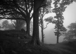
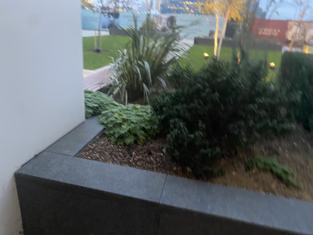
The photographer has chosen to include and focus mainly on the background for the photo by making it landscape. I think the photographer may have tried to exclude any sort of living thing to give the photo an old look. The relationship the photographer might have to this photo is that this might be a place that they've known for a while and wanted to maybe revisit it. I think the vantage point is at a straight on level, I think this is because the photographer may have put the camera on chest level to make it seem like that. I think we are very distant from the landscape and it feels like that because of the area the photo was taken in. This landscape could give an idea of how photos can be taken in different ways and in unusual locations and still could be considered as a good landscape. Also the mood has an affect on how the photo looks like the colour and what is included.
Back to the Future


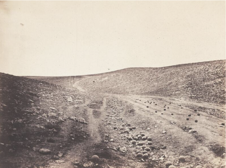
These 2 photos are both landscapes. The landscape on the left is a more natural life included landscape and the one on the right is more rocks and more outlined and clearer to see. I don't think there's many similarities between these two landscapes. My first impression of the photo on the left is that I quite like it because of the way it's been framed and how its black and white. My first impression of the right photo is that it's a quite different concept and it's unique, These types of landscapes can be good because you're not always sure what it actually is. The camera position of both these photos are most likely eye level and the angle are the same in both of the landscapes.
Minimalist Landscapes: What Remains

Geraldo de Barros - from the series Sobras, 1996
Geraldo de Barros was a Brazillian painter and photographer who also worked in graphic arts and industrial design. De Barros was known for his work in apstract photography and this famous landscape.
|

Liz Nielsen - Gardening with You, 2020, Photogram
Nielsen is a photographer who used traditional analaog photography methods with hand-made negatives and natural lighting. Her work has been exhibited like these hand-made landscapes which was one of the most successful ones.
|
What I can see from these photos is pieces of paper cut out and then stuck onto another piece of paper to make an outline of an original photo. What i find surprising is how accurate they managed to do it. When looking at these photos I think that they're good ideas and the way they have done them. The way id attempt to make these photos for example the left one I'd print out the photo and then cut out a certain piece of it and then stick it onto a piece of paper. I think each artist has decided to remove parts of the landscape to not make the image so clear on what it is. Out of the two photos I prefer the right one more because I think it's more interesting how it was done and I think it took more work than the left.
Centre of British photography


What we did at the trip was we was taking photos of different photos in the gallery from different photographers. I think most of the photos were landscape with a bit of a description under or beside it. The photographs I enjoyed the most was the ones that looked like they were in space with a lot of things going on. I think the lighting was perfect on the photos and the way they were laid out and displayed. I think there were some different themes like a more nature themed photos, unusual photos which isn't obvious on whats going on. The reason why I think the photographs are good is because of what is included in the photo which is many different things. The place has six exhibitions spaces with many photography galleries in different rooms and a programme of public events. We saw 5 of the six exhibitions which were called landscape trauma', 'seduced by light', 'helen sear', 'a storied ground', 'plastic soup'. I think my favourite was the 'plastic soup' exhibition because of the unique photos.
Photograms
Hiroshi Sugimoto


What I see in these photos are out of focus images of buildings in black and white. I'd describe this photo as minimalistic and not too over the top. The equipment they used is probably a camera and made it out of focus and made sure he gets the angles right. I think what is effective about these photos is the out of focus feature of different buildings with black and white colour making it unique. I think what doesn't work so well is the background is the same in all photos including the sky. I think other people would think that the angle of the photos are good and the idea is creative. I think that because it's a very unique idea because most people that do this include colour which is a big difference. I think what is worth remembering about these photos is that it only includes many different buildings and towers in each photo. What I have learned from these photos is the way these photos were taken and how effective it makes them, I also learned that it doesn't need to be too over the top and can be done very simply.
My attempts


The type of photograph these are are out of focus photos of buildings in black and white and i was inspired by Hiroshi Sugimoto. It shows either a landscape or portrait of buildings with a blur. These photos were taken today and around my school. These pictures are not a truthful depiction of its subject because its not abstract and its blurred. The reason I took the photos was to attempt to do the same idea as the photographer I chose. I think the photograph achieved the original purpose which was create an out of focus image in black and white just like the photographer. I think the effect it has is there's not a lot going on which I think is good about these types of photos. I don't think it really changes my knowledge but i think it's useful to know and quite interesting how it works. I don't think it's relevant as historical evidence because I don't think a lot of people take these types of photos.
Hiroshi Sugimoto homework


These 20 photographs that I took were all inspired by Hiroshi Sugimoto. The experience of working with out of focus images was enjoyable and I think it was a good way of taking photos.I think the photos that went well the most were up close photos of the buildings. When taking these photos I experimented with different buildings and level of blur. I think the photographs I took don't look too bad and I definitely had a go at it. A way i could further develop this idea of taking out of focus images and get different angles.
|
|
What Dafna Talmor has been interested in is a notion of a utopian space, a space that doesn't exist but feels and looks like reality. She approaches her slides from a different perspective by making it exist only in a photographic sense. She edits hers with adding more to her landscapes and mixing 2 or more cut up pieces of photos to make 1 landscape. My approach compared to hers is different because I would probably edit my slides by adding different colours to the landscapes but Dafna Talmor looks at it differently.
|
Slides


With these slides i'm happy that I managed to complete this work and I think i've done it correctly. What I didn't do too well was the frame of the image because i had to get the projected slide in the centre of the frame which was a bit hard because id be covering the slide with my shadow as i'd be in front of the lens. When making the slides i used different colours in a single slide most of the time covering the main focus of the image which would be the buildings, I also outlined parts of the image with a sharp tool and kept experimenting with the 6 slides I made.


When taking these photos I was pleased mostly with the fact that they fit for what I was trying to do in lesson with the videos. What i focused on when taking these photos was to get some normal photos and not overcomplicate it and just let it flow. One thing I kept in mind was the framing and what to include in the photo, I also made sure the angle was fine for the photo so it doesn't look too strange. I think what went well the most was the lighting for the images because some were when it was brighter and some where it was darker. If i was to take these photos again I think I should take more photos so I have more to experiment with, I should also try not to rush it and take my time.
Dionne Lee
|
Drafts from Dionne Lee on Vimeo. |
This work by Dionne Lee is a very different piece of work compared to others. What Dionne Lee does in the video is she has a series of photos and tries different things with about 3 or 4 photos and makes a constructed landscape. To make these she does things like folding parts of her printed out photos aswell as cutting out some pieces and then combining them to make a constructed landscape, she also adds a different photo on top of the constructed landscape she's made to make another one and then repeats the process of this.
|
|
|
I think i'm happy with the results from this video because I experimented with it and tried different things to construct a landscape like ripping and folding parts of the pictures and combining 2 types of photos to make a landscape. What I don't think went well is watching back the video I noticed some of the landscapes weren't in the frame.
|
John Divola


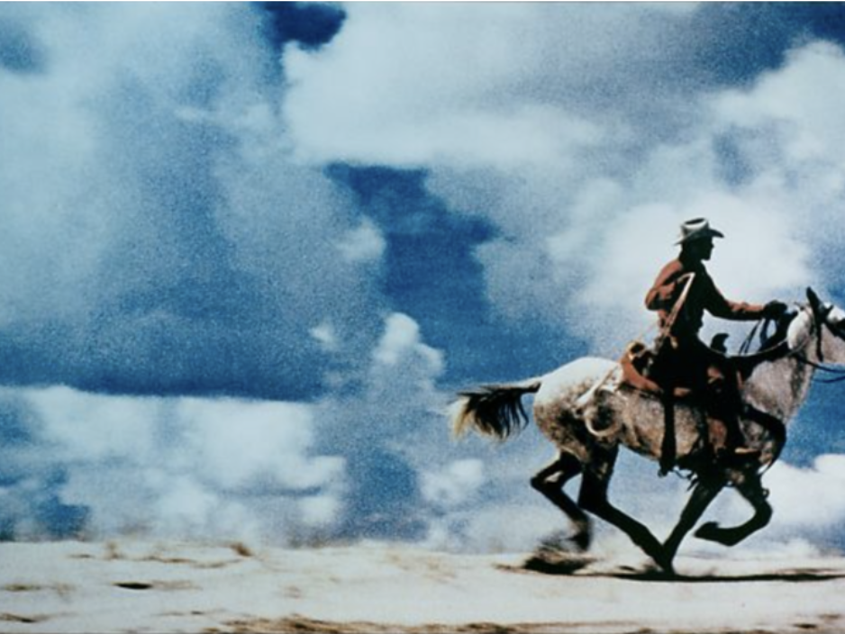
My first impressions of these photos is that it's taken of the natural life of the world and I can see it involves a lot of photoshop making them unusual as a landscape. The purpose of these photos could be to have the people who look at these focus on a specific thing, The intentions for these photos could be to try something different compared to other landscapes. These photos specifically are taken in the woods or forest. It shows some objects or figures used with photoshop. The time it could of been taken was probably in the afternoon and night. These photos were taken to try something different and I think the photograph did achieve its original purpose. The effect it has today is it can influence many people to do the same thing. I think it informs my knowledge because it's a style I like and would like to do it and I think it would help other people's knowledge better. This could be reliable for historical evidence but there's a lot of different styles which could be better.
Homework


With this homework I think I had a good idea on what to do and half of the photos were executed well. With these images I tried taking pictures of things that would go well with how i choose to use photoshop with them. I was thinking about the frame of the image and what to include in the photos I took which wasn't that tough. If I was to take these photos again I'd think a bit more into what ideas I can include when taking the photos. I also need to experiment more as most of my photos have the same kind of theme. Another thing i can do better is not rushing the process and taking my time.
My first set of attempts

|
|
Second set of images


When taking these photos I was deciding what type of style to take these photos which I ended up kind of sticking with what I did in the first place. I experimented with it quite a bit and looked at how I can improve and make my second set of images better than my first set of images. Looking at these photos I am sure that the second set of photos were more successful because I had more of an idea on what to do.


